Showing posts with label Living Room. Show all posts

Friday, March 13, 2015

Wall Decor | Tying It All Together

Hey everyone!

Sorry it's been pretty quiet over here... but I'm happy to say that I'm BACK with a new post :-)

Justin and I have lived in our home for 3 YEARS now and slowly but surely I've finally hung some artwork.  Our living room, in particular, has been a challenge for me.  BIG BLANK WALLS!

Here's a BEFORE picture of our living room when we first bought the house:
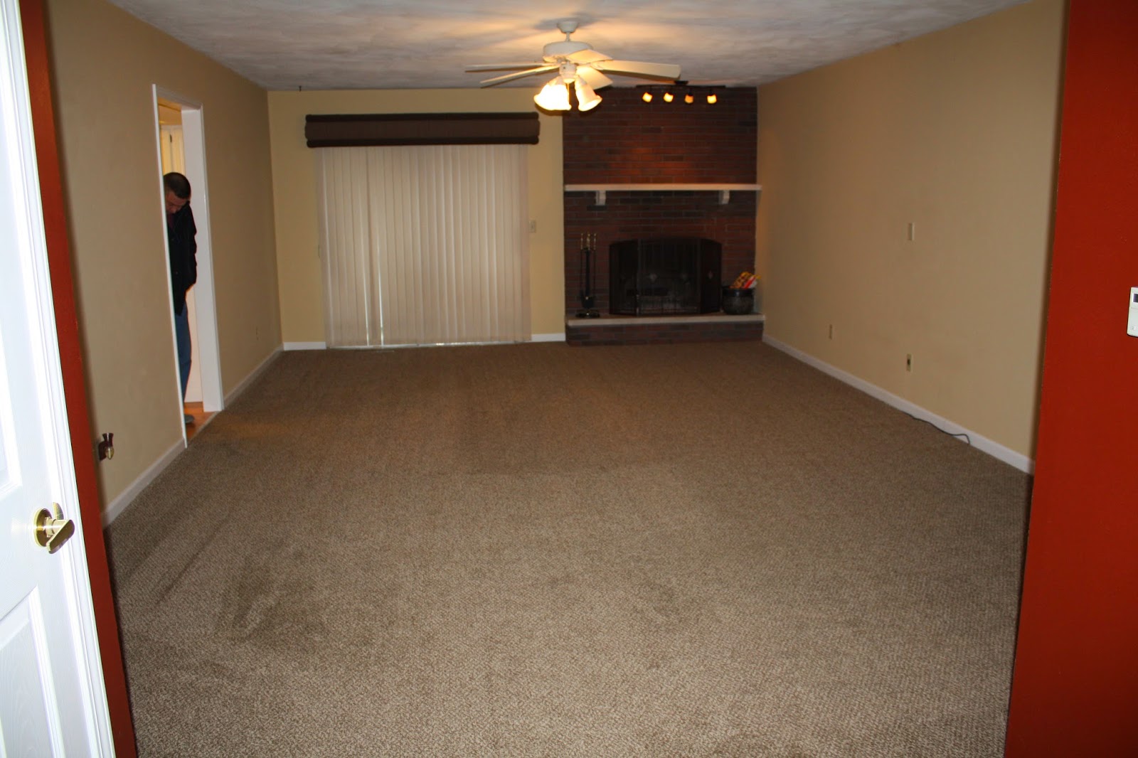
The wall on the right is where I have our TV gallery wall that you've seen in a past post.  Soon I will do an updated post on how those frames are looking today (hint: they all actually have art in them-hooray!)  The wall on the left stayed blank for a very long time.  I have a little cove with a wet bar next to the entrance of the living room and I could never decide how to connect all of these spaces in a seamless and eye-pleasing way... but I think I've finally figured it out.

Here is a before shot of the wet bar:

Eeeeeek!  Don't worry, it is looking better these days :) but it is still a work in progress.

I immediately decided to paint the cabinets white and leaned a large mirror on the counter and this is how it looked for a couple years:

I always dreamed of a big statement mirror on the blank wall but I already had a big mirror over the wet bar!  I eventually decided to sell the wet bar mirror.  I had some grass-cloth installed on the back wall to add some texture and I plan to eventually put up some shelving.
 

Here is how the wet bar looks today:
 Obviously some of those items will go on the shelves once they are installed :)  And the ski leaning against the wall is a shotski my husband made me for my birthday last year (Big WWHL fan over here-duhhh!)  I also want to change the lighting situation.  It gets very dark in that little cove so a can light just won't cut it.  Still on the hunt, so let me know if you see anything fabulous!

To solve the blank wall situation, I decided to hang a grid of identical frames all the way down the wall.  And of course I had to have this gorgeous mirror be a part of it.

When I saw this mirror that the fabulous, Dina, from Honey & Fitz, used in a client's dining room I knew I had to have it.  I'd MAKE a place for it! (side-note:  I just saw that it is now sold out-boo!). 

Here are some wide shots so you can see how it flows:


 On the other end of the wall is the only area of our home where we get fantastic sunlight.  Therefore it is our plant zone!  Full of green:
Frames - Michaels | Inner Matting - Amazon | Brass Owl - Momoderne | Tray - Nate Berkus for Target

I found the bamboo console (along with my matching coffee table) on Craigslist.  I love the grid of frames over the console.  I did a double matting and sprayed the inside matting gold so it would POP!


I wanted to have a coordinating set of artwork in all 10 of the frames so I once again sought inspiration from a link I bookmarked on Dina's blog (you seriously need to follow her!)  It is a collection of over 96,000 F-R-E-E vintage illustrations.  There are tons of beautiful and colorful butterfly images that I quickly settled on as my theme.  Butterflies (or papillons- in French) remind me of my adorable little pup Wylie.  He is a papillon breed and they're named for their butterfly-like ears!!
He's so darn cute!  Thanks for the inspiration, buddy!

Here are some more shots!
I just love it!


I saved the images for the butterfly images I used in case you are interested in using them in your own home!


Aren't the colors great?  So what do you think?  Does it all tie together now?  I'd love to hear your comments or questions.  I will keep you updated as I continue to work on the wet bar.

Thanks for reading and HAPPY FRIDAY!
Emily

Sunday, November 9, 2014

CHAIRISH Room Design

Hey!

Sorry for the silence lately... I had planned on posting last week but then I got sick... and basically did nothing but rest after work everyday!!!  Well I'm finally feeling better and I have a fun post for today.

I was recently contacted by the company, Chairish, to see if I'd like to be involved in their Style Challenge... umm yeah!  Chairish is an awesome company that makes it fun and easy for design lovers to buy and sell pre-loved decor to one another.  They have lots of great vintage pieces that are easy to style and unique!!  I was asked to choose an item from one of their collections and design a space around it.  It was a difficult choice, but I fell in love with this golden velour three-seat sofa:

 Isn't she a beauty?  I love the golden yellow color and its simple yet interesting shape.  I wanted to create a cozy warm space around this piece; a place where I could curl up with a book, a cup of tea and a blanket and relax!

Rug | Chandelier | Chair | Coffee Table | Fur Pillow | Leopard Pillow | Lamp | Accent Table | Pouf | Gourd Vase
 I think the sofa steals the show!  The warm color sets the stage for the entire space.  The leather chair, coffee table, and GORGEOUS light fixture can all be found on Chairish.com.  I love the warm tones these pieces add to the room.  The rug adds a lot of pattern, nice texture and really grounds the space.  The pillows also add more pattern and texture (I'm obsessed with that leopard fabric).  I finished the room off with some affordable pieces like the accent table, lamp, and pouf.  Oh, and every room should have a fresh plant or two!  

What do you think?  Is this a room you could see yourself in?  I'd love to hear your comments.

P.S. - Later this week I plan to share some updates on my living room and how I decorated for fall, so check back!

Thanks for reading!

Emily

Sunday, October 12, 2014

Budget Fireplace Makeover

When Justin and I first bought our house, one of the aspects we loved about it was that there is a wood burning fireplace!  HOWEVER... it looked like this:
 

CONS:
-Dark brick color (same as the exterior of our home) makes the room feel darker.
-Hearth and mantel are dirty cement... there is nothing appealing about it!
-One side is against a wall and it is off to the side of the entire room!
-The track lighting is ugly...!

PROS:
-It functions!  That's always a good thing!
-It doesn't look completely terrible... I knew I could work with it :)

So before Justin and I moved in we had some MAJOR paint parties... like literally paint every room, ceiling, baseboard, door frame, etc. kinda parties...!  I remember we decided to start tackling this project around MIDNIGHT one winter evening (we are nuts) and immediately regretted that decision.  After cleaning the bricks, we started with a couple coats of Olympic Masonry Block Filler.  It's a primer for fireplaces that helps fill in the tiny cracks and pores in the brick and mortar.  It is amazing and totally frustrating how much paint the brick absorbs.  You really have to slop it on to fill in everything!  We then used one of my favorite paint colors, Swiss Coffee by Behr.  It's a really creamy white that gives warmth to the space.

After a couple coats of paint, the fireplace looked like this: 
Big difference... but I still HATE the cement hearth and mantel and I still cringe when I look at this picture!  I'll show you a closer look at how gross this cement really is:
YIKES!  It has looked like that since about January 2012...

I've had very grand plans for this fireplace... like a complete overhaul... (as you can see my drawings on the left-hand side of the above picture) however, I want to make sure it would coordinate with other future plans I have for our wet-bar and kitchen... so I will just hold on to those ideas for now :) and keep saving.

I finally painted the hearth and mantel a couple months ago (not sure why I didn't paint it from the beginning!?)  Here is what it looks like today:
Picture - Goodwill | Candle Holders - TJ Maxx CLEARANCE! | Basket - Marshall's | Blue Throw - Target
Big improvement but it still needs work!  I did a rendering of what I would like to add in the near future:
  
Okay so lets start with the big piece... a new mantel.  I would love to remove the cement piece and get a nice piece of reclaimed wood.  Wouldn't that be lovely?

Next I would like to refinish or re-frame my Goodwill art-piece.  The current wood frame is a yucky cherry stain that just isn't my cup of tea.  I'm thinking something more natural looking.

I'd also love to add a beautiful pair of blue and white Chinese porcelain vases.  This pair runs a mere $460... so I think I'll keep looking.  It's hard to find pairs for a reasonable price!

On the hearth, I would love to add a Boston fern to the opening of the fireplace.  I am considering an artificial one, since it will get very little natural light.  I haven't seen any nice ones in person, but I figured since no one will be close to the plant, it might not be too noticeable?  We shall see!

I already ordered the adorable striped copper candles for my candle sticks.  I can't wait to see how they look in person.

So that's all I have for now.  I'm sure I will totally change the decor once we start using our fireplace this winter... but I'm liking this much more than the sparse look I had a few months back.

What do you guys think?  I'd love to hear from you :)

Happy Sunday and GO CARDS! (we will be cheering at the game tonight!!)
Emily

Sunday, December 29, 2013

Goodwill Chair Makeover - THE REVEAL


Hey Everyone!

Sorry for the 2 month hiatus - I've had a busy couple of months, but I'm finally back :)

I realized that I never posted a reveal of my Goodwill Chair Makeover that my sister and I worked on together.  If you need a refresher on where we left off, click HERE.

I chose a beautiful peacock blue fabric for the front part of the chair - found at Joann.  I bought 2 yards of this fabric.  As for the back, I found a multi-colored toile fabric at Hobby Lobby and bought just 1 yard.  I couldn't find a link for either of the two fabrics but I paid around $10-$15 per yard, if I remember correctly.  The rest of my supplies {piping filler cord and dust cover for bottom of chair} were purchased at Joann.  Remember to always use a coupon {both stores have apps you can d/l}!!

Here she is:


I used a trick I learned from the fabulous Kristin | The Hunted Interior:  DOUBLE PIPING. {on a side note:  you MUST follow her blog.  She is so inspiring and has EXCELLENT taste in everything she does!}


Adding a double welt makes you look like a PRO and covers up sloppy stapling ;)  I {my sister} simply sewed two lengths of piping together and we hot-glued it right on top of the fabric.  Easy Peasy.  We just did a single welt for the bottom seat of the chair.  As for the buttons, I used the existing ones and recovered them in the new fabric with some hot glue.


I love how the blue fabric seemingly changes color throughout the day, depending on lighting conditions.

Here's a couple shots of the back:


Toile may not be for everyone.  Heck, I'm not usually drawn to it either, but I love that this particular fabric has so many different colors in it.  I feel like I never see that - it's usually a monochromatic color scheme.  I also love the large scale of it!


What do you guys think?  Not too shabby for my first chair re-upholstery project - eh?

A special THANK YOU goes out to my sister for helping me.  I couldn't have done it without you {literally}!!!

xo
Emily

Saturday, September 28, 2013

Goodwill Chair Makeover - Part 1

Hello!

If you follow me on Instagram.  You'll remember that I scored a great barrel-back cane chair for only $15!!

Here's what she looked like:

The chair is in great condition, I just wasn't loving the fabric.  

I wanted to choose a solid fabric for the front and a fun accent pattern for the back.  I chose a pretty peacock blue fabric and found a gorgeous colorful toile fabric for the back panel.  I plan on using this chair in my living room and I figured the blue is neutral enough to fit in a lot of different spaces/design schemes but it's much better than a boring beige (my couch, 2 chairs, and carpet are all some form of brown/beige)!  Here's a sneak peek at the back panel:


The fabric on the ground is for the rest of the chair.  It's going to be so so cute!  I will post the finished product soon.

Have a great Saturday! 
Emily

Wednesday, September 25, 2013

Gallery Wall - Part 2


Hello again!

Last time we left off my gallery wall-to-be looked like this:


I wasn't happy with how the upper left-hand corner was looking so I switched things around and ended up with this:


It's a bit more symmetrical without being too matchy-matchy, which is what I was going for this time!  And here's how the frames look after I hung them!


I'm loving it!!  Let's take a closer look!


As you can see, I don't have many frames filled just yet!  I'm working on it - I will post again once they are all filled.

My favorite part about the gallery wall is the black Target frame I jazzed up with some hardware and hammered nailheads!


What do you think?  Do you usually collect your art first or pick out your frames first?

Thanks for looking!
Emily